
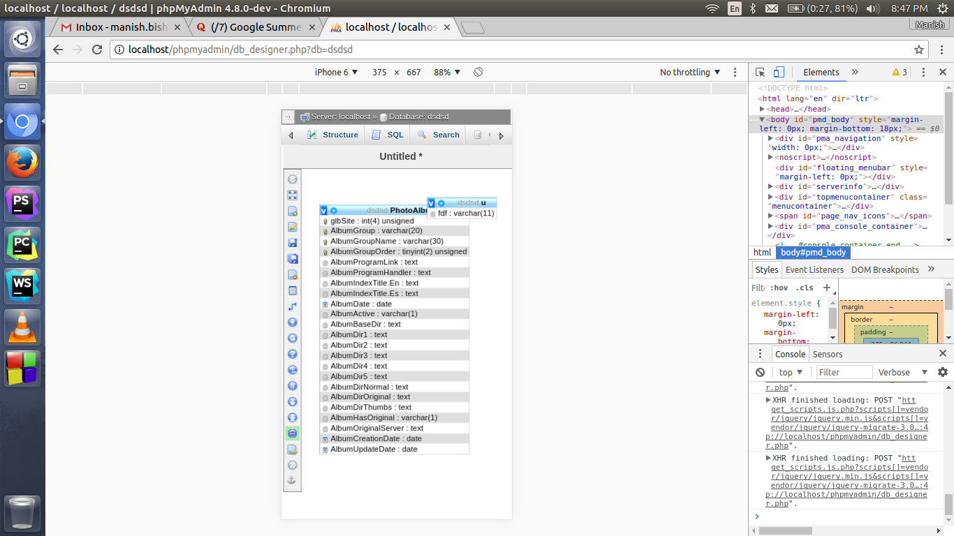
Hi, So I think of 2 solutions now. 1. Just show as it is showing right now. (Bad for Mobile) 2. or to set the height and width of div with id `osn_tab` according to mobile height and width. In this way it is possible that the tables overlap on each other. Screenshot attached. Thanks, Manish Bisht Email : hi@manishbisht.me Website : https://manishbisht.me On Fri, Jun 23, 2017 at 11:24 PM, Maurício Meneghini Fauth < mauriciofauth@gmail.com> wrote:
Hi,
Wouldn't it be better to just display the non-responsive desktop version than to display this message?
Maurício Meneghini Fauth
On Fri, Jun 23, 2017 at 12:21 PM, Manish Bisht <manish.bisht490@gmail.com> wrote:
Hi,
As I am working on making phpmyadmin responsive. I think that there is no need of showing database designer view on the mobile devices. So I am preferring to show some message like "This view is only available on desktop".
I will be looking forward for your views and suggestions.
Thanks,
Manish Bisht Email : hi@manishbisht.me Website : https://manishbisht.me
_______________________________________________ Developers mailing list Developers@phpmyadmin.net https://lists.phpmyadmin.net/mailman/listinfo/developers
_______________________________________________ Developers mailing list Developers@phpmyadmin.net https://lists.phpmyadmin.net/mailman/listinfo/developers